Typography is more than just an aesthetic choice—it’s a cornerstone of branding. Whether on a logo, a poster, or a website, fonts play a key role in how a brand is perceived. A well-chosen typeface can tell a story, convey values, and, most importantly, leave a lasting impression.
In this article, we’ll explore the impact of typography on branding and the emerging trends that are set to shape tomorrow’s visual identities.
Why Typography Is Essential for Branding
A Unique Visual Language
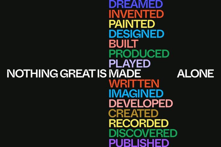
Typography is a visual communication tool that conveys emotions and messages before the content is even read. A bold font can inspire confidence, while an elegant typeface suggests sophistication.
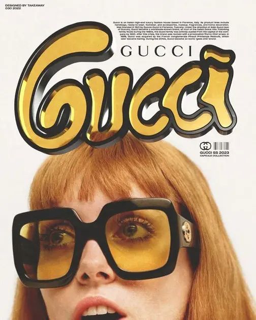
For example, luxury brands like Dior or gucci use sleek and refined fonts to reflect their heritage and exclusivity. In contrast, modern brands like Netflix choose bold, minimalist typography to highlight their forward-thinking approach.
Creating a Cohesive Visual Identity
Typography contributes to a brand’s visual consistency by aligning all communication materials under a unified identity. The right typeface helps to:
- Enhance brand recognition
- Establish credibility and consistency
- Differentiate the brand in a crowded market
A great example is Spotify, which adopted its custom font, “Spotify Circular,” to unify its branding across all platforms.
Typography Trends for the Future
Typography is constantly evolving, influenced by technological advances and consumer preferences. Here are some of the trends shaping its future:
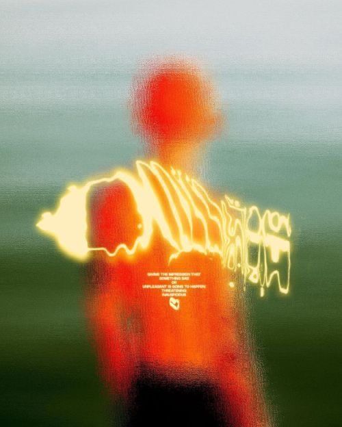
Maximalist and Bold Typography
Oversized, experimental fonts grab attention in a world overloaded with content. These typefaces break away from traditional norms to add creativity and originality.
- Example: Nike campaigns use bold, oversized fonts to convey energy and dynamism.
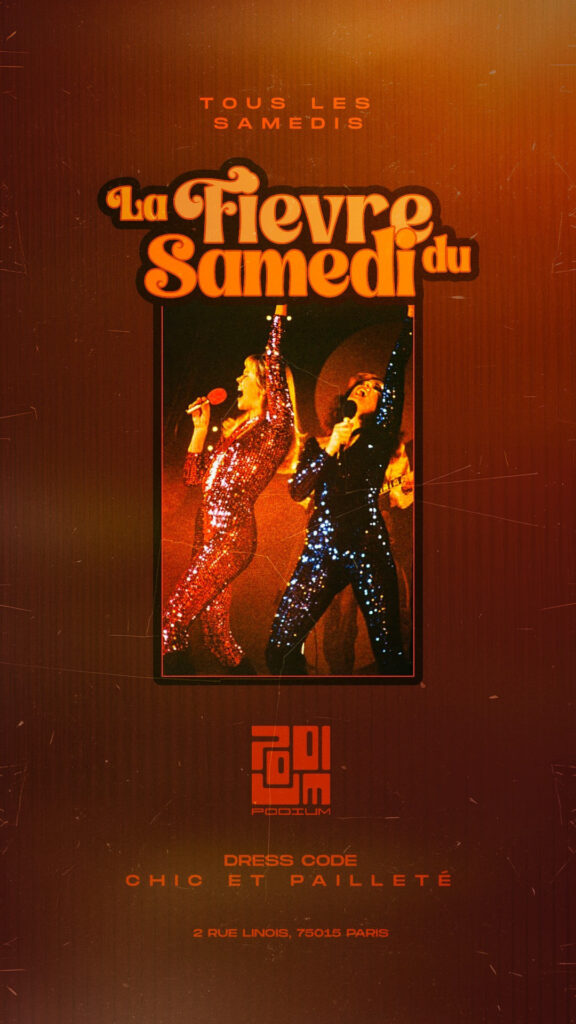
A Return to Retro Fonts
Inspired by the 70s, 80s, and 90s, retro typography evokes nostalgia. It allows brands to create an emotional connection while tapping into styles that recall a specific era.
- Example: our restaurant Bistrot Podium leverages retro, soft typefaces to embody a nostalgic yet modern aesthetic.
Variable Fonts
Variable fonts, which allow designers to adjust weight, width, or slant, are becoming increasingly popular. They offer flexibility for creating designs suited to different platforms and devices.
- Example: Google Fonts highlights variable fonts like “Roboto Flex,” offering versatility for digital applications.
Custom Typography
More brands are investing in bespoke typefaces to stand out. Custom fonts strengthen visual identity and make a brand instantly recognizable.
- Example: Coca-Cola developed a custom typeface to modernize its branding while staying true to its legacy.
Keys to Successful Typography for Branding
1. Understand Your Audience
Your typography should speak directly to your target audience. An elegant typeface can attract a sophisticated demographic, while a playful font suits a younger crowd.
2. Prioritize Legibility
While boldness is important, readability should never be compromised. A font that’s too complex can hinder the message’s impact.
3. Test and Optimize
Test your typography choices across various mediums (print, digital, mobile) to ensure they perform consistently.
Conclusion: Typography as a Pillar of Modern Branding
In a world where visual identity is crucial, typographic choices can be the difference between a brand that blends in and one that stands out. By embracing bold fonts tailored to their audience and values, brands can tell a compelling and authentic story.